Spectrum Reach
Full MVP website redesign aimed at targeting specific user segments in a lead gen funnel.
Background
A small cross-functional team was hired to start work on a refreshed, modern website for Spectrum Reach. To date, Spectrum Reach’s web presence had been relatively lackluster and was not been updated in many years. Additionally, the experience was painfully fragmented for users which caused a significant drop-off prior to conversion. The business was looking to make its website the online hub of the prospect experience by delivering customized journeys for users, focusing on four primary segments.
Duration
Ten month end-to-end product launch
My Role
Product Designer
Deliverables
User Research, Competitive Research, UX Design, UI Sprint, Visual Design, Content Strategy


The client had engaged an outside agency for user research, so my team and I inherited months’ worth of materials including:
User Segmentation Research
Stakeholder Interview Recordings
Full Research Report with 20 hours of user interview recordings
After digging into the documentation and conducting market research for similar buy-flow websites, here’s what we found:
Our initial assumption was that we could easily improve conversions and enhance user engagement by simplifying the information architecture and user journeys.
In reviewing the user segmentation research, we found that our customers' diverse needs meant they would use our various advertising solutions in different ways, depending on a multitude of factors such as their team size, budget, objectives, and more.
I led a service design exercise that identified a miss on the backend experience. Customer service reps were doing a large amount of research on their potential clients prior to engaging with them.
Inheriting research
Both small and large brands are looking for product solutions, education and social proof directly relevant to their brand and marketing goals in order to establish trust in a new media advertising company.
The ultimate challenge was designing a mid to late-stage funnel experience that would cater to everyone from IBM to Mercedez-Benz while also considering your local mom-and-pop restaurants and hair salons.
As a core team, we asked: what would happen if we developed an interactive element of the web experience? It could request simple information from users such as their goals, business size, and location. In turn, the user would receive personalized solutions and the form fill would have dynamic capabilities. Furthermore, account reps could gain a more clear understanding of their incoming prospects.
Nailing down the problem


Educating the Client on UX Value
Our client had a very strong relationship with the firm conducting the strategy and research for this product and this project was their first exposure to our design team. Very unfamiliar with the process and principles of UX/UI, we had to educate the client weekly on the goals of deliverables and outputs of processes. When we were heading into the UI phase, our design team took their current brand guidelines to inform multiple design directions. Unfortunately, our designs were not well received and we knew we had to pivot.
Planning a structured UI sprint led to the biggest success in improving the client relationship. We chose a stakeholder decider, added the client’s design team to the exercise, and explained our reasoning along the way. When the output was revealed, stakeholders were aligned and pleased with the direction. This exercise helped build a foundation of trust with our new partners and a way forward.
Team brainstorms and working sessions led us through wireframes and high-fidelity comps while meeting weekly with stakeholders for approvals and feedback. Given how quickly we were moving, we vetted designs with internal designers for feedback but were unable to incorporate formal user testing into the timeline. We knew we needed to ship the site by the deadline and leverage analytics and quantitative data post-launch to determine further enhancements.
Navigating Content Approvals
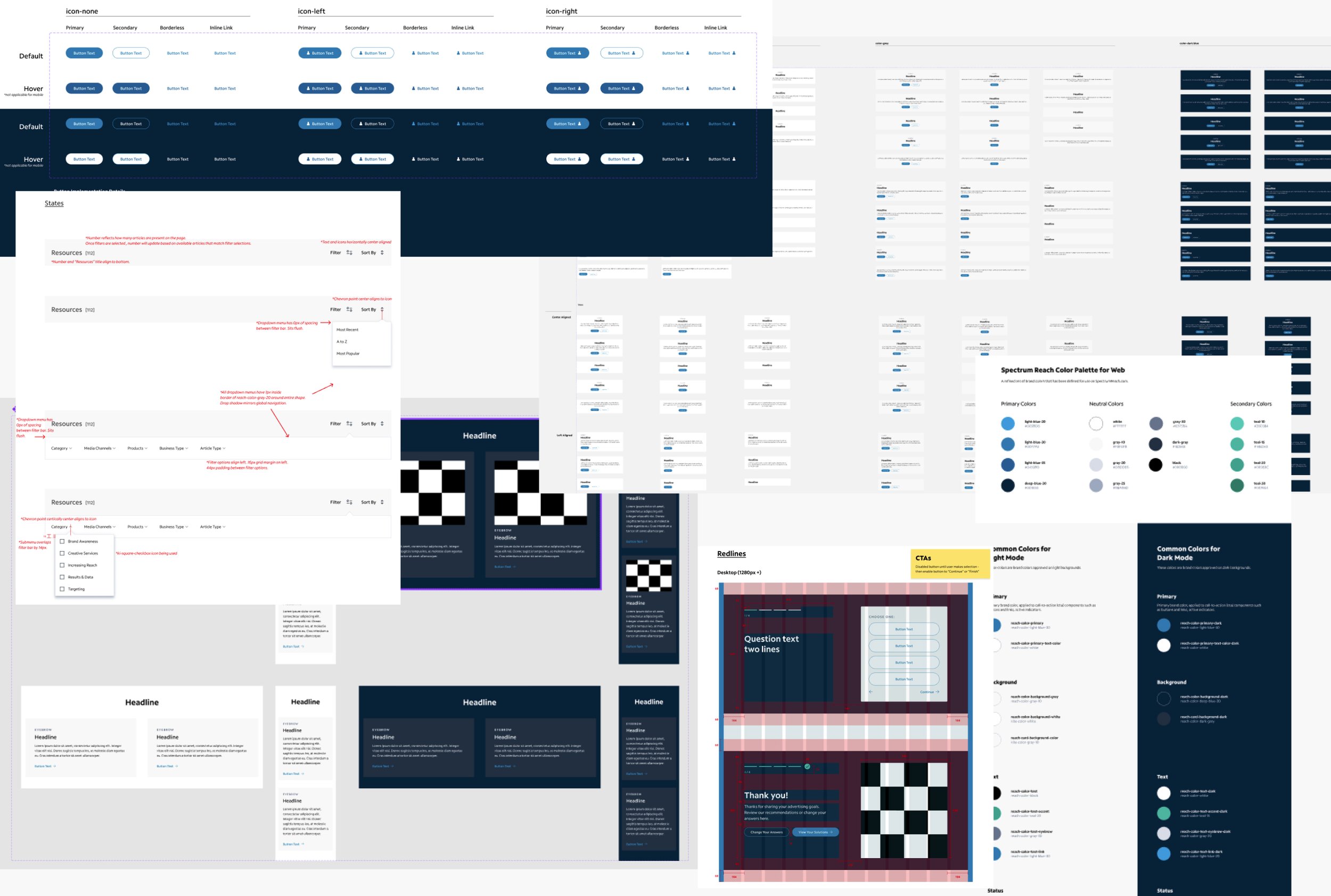
Building a Custom UI Kit
We moved quickly through approvals and began building the UI Kit. I spearheaded this effort and built componentry to facilitate delivery and support authoring. Modules were designed to a grid at multiple breakpoints for a consistent, cohesive experience.
“Alexa took the reins on UI Kit creation. She put together a well organized and thoughtful document that we could all understand and contribute to throughout the ever-evolving process.”
- Design Teammate
Redlines were provided to developers to start the build, but I learned too late that we didn’t have a full picture of how they were building. I worked hard to retroactively speak their language, but this experience taught me the importance of building a foundation with a new development team earlier in the process.
About two months before launch, the client began developing new content. We had encouraged strong consideration of content earlier in the process and especially through approvals. Unfortunately, we were at the eleventh hour and they were struggling with how to use the componentry to house their new content. Acting as a strong partner, we added another round of comps to our timelines to help facilitate final approvals. We were racing to the finish line, but we all headed into the holiday season with a successful launch.